
Colour Theory in Floral Design: How to Choose Flower Colours for Every Mood & Occasion
Why Colour Speaks Before Words
Colour is often the first thing we notice in a bouquet, even before we consciously recognise the flowers themselves.
Before the fragrance wafts through the air or the petals reveal their texture, colour quietly begins to shape the mood. Soft blush tones can evoke a sense of gentleness and comfort, while vibrant crimson and gold naturally infuse a space with energy and celebration. The emotional impact is immediate, even if it's hard to articulate at first glance.
In floral design, colour theory plays a crucial role in creating a sense of balance and intention. It guides how tones blend, soften, contrast, or bring calmness to an arrangement. More than just enhancing the beauty of bouquets, colour enables flowers to convey emotions in subtle yet deeply human ways.
A thoughtfully arranged bouquet can celebrate an achievement, offer reassurance, express gratitude, or brighten an ordinary day without needing many words at all.
Understanding how colour interacts within floral design transforms flowers from mere decorative arrangements into gestures that feel personal, meaningful, and emotionally resonant.
Key Takeaways:
-
Thoughtful use of colour theory helps floral arrangements feel emotionally balanced, intentional, and visually harmonious.
-
Warm palettes often create energy and celebration, while cooler tones tend to bring calmness, reflection, and comfort.
-
Soft transitions between related shades usually feel more soothing and versatile than highly contrasting palettes.
-
Texture, foliage, lighting, and proportion all influence how floral colours are perceived within a space.
-
The most meaningful bouquets balance aesthetic beauty with the emotions, cultural context, and personal preferences behind the gesture.
Understanding Colour Theory in Floral Design
At the heart of floral styling lies an understanding of how colours relate to one another.
The colour wheel serves as the foundation of colour theory, illustrating the relationships between primary, secondary, and tertiary tones. In floristry, this framework helps create arrangements that are visually balanced and emotionally cohesive, making bouquets appear thoughtfully composed rather than haphazardly put together.
Different colour palettes can evoke a range of moods. Some combinations feel soft and calming, while others exude contrast, energy, or quiet sophistication. By grasping these relationships, florists can infuse their arrangements with emotion, ensuring that each bouquet resonates with the occasion, space, and sentiment behind it.
Monochromatic Floral Design
Monochromatic floral design centres around a single colour family, layered through different shades, textures, and bloom sizes to create depth without relying on strong contrast.
A bouquet made up of dusty rose, blush pink, and soft mauve, for example, can feel incredibly refined because the beauty comes from subtle variation rather than dramatic colour shifts. When carefully balanced, monochromatic palettes often feel calm, contemporary, and quietly elegant.
Within colour theory, this approach relies heavily on texture and tonal depth to keep the arrangement visually interesting. Ruffled garden roses, airy carnations, delicate lisianthus, and layered peonies each interact with light differently, allowing the bouquet to feel soft yet dimensional even within a restrained palette.
This style is especially suited to contemporary interiors, intimate celebrations, and thoughtful gifting moments where subtlety feels more meaningful than bold visual impact.
Analogous Colour Palettes
Analogous palettes combine colours that sit next to each other on the colour wheel, resulting in arrangements that feel smooth, balanced, and naturally harmonious.
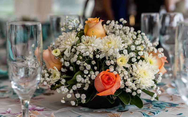
For example, blush tones layered with peach, apricot, and warm cream create soft transitions, allowing the bouquet to convey a gentle touch rather than sharp contrasts. The seamless flow of these shades often evokes feelings of romance, comfort, warmth, and emotional ease.
In colour theory, analogous palettes are appreciated for their ability to create harmony without appearing flat or overly uniform. The subtle shifts in tone provide bouquets with depth while maintaining a calm, cohesive atmosphere.
This approach to colour selection is particularly popular for weddings, thoughtful thank-you bouquets, and meaningful celebrations, where a softer aesthetic is more fitting than bold visual statements.
Gentle analogous palettes are also frequently seen in arrangements such as flower bouquets for mothers, where layered pastels and graceful tonal transitions express affection, appreciation, and quiet tenderness.
Complementary Colour Combinations
Complementary colour combinations pair tones from opposite sides of the colour wheel, creating contrast, movement, and visual energy within an arrangement.
Imagine coral set against soft teal foliage, or lavender layered beside buttery yellow blooms, with deep burgundy softened by muted sage green.
These pairings naturally draw the eye as the colours enhance one another through contrast. However, balance is essential within colour theory. When thoughtfully composed, complementary palettes feel vibrant and expressive without becoming harsh or overwhelming.
This quality makes them particularly suitable for celebratory occasions, festive gatherings, and statement arrangements where a stronger visual presence is desired.
In Singapore, bold complementary palettes are often featured in congratulatory flower stands, where vivid contrasts convey joy, encouragement, and success in a lively yet refined manner.
The elegance of complementary palettes typically hinges on proportion. One tone often serves as the anchor for the arrangement, while the opposing colour subtly appears through accent blooms, foliage, or smaller details. This approach ensures that contrast feels intentional, polished, and emotionally balanced, rather than visually chaotic.
Neutral-Based Floral Harmony
Neutral palettes consist of whites, creams, soft greens, beige tones, and muted blush hues, all of which create a sense of calm and visual balance.
Instead of relying on strong contrasts, these arrangements emphasise softness, texture, and spacing to shape the overall mood. A bouquet of ivory roses, pale hydrangeas, and gentle eucalyptus can exude quiet elegance on its own. By introducing a single accent bloom, such as a deep crimson orchid or a rich burgundy rose, the emotional tone subtly shifts without disrupting the arrangement's harmony.
In colour theory, neutral palettes are valued for their versatility and restraint. They allow the natural form of each flower to stand out more distinctly, highlighting texture, silhouette, and negative space alongside colour itself.
This approach is particularly popular in contemporary floral styling, where understated beauty often feels more timeless and emotionally grounded than highly saturated palettes.
Neutral arrangements also adapt beautifully to various cultural settings and occasions, making them thoughtful choices for both personal gifting and formal celebrations.
Hue, Saturation, and Value in Floral Design
Beyond the colour wheel, floral design relies on three key visual elements that influence the emotional and visual impact of an arrangement.
Hue refers to the colour family, such as pink, yellow, blue, or green.
Saturation describes the intensity of a colour. For instance, a muted dusty rose can evoke a soft, nostalgic, and understated feel, while a vivid fuchsia from the same colour family can appear energetic and expressive. Even subtle changes in intensity can dramatically alter the atmosphere of a bouquet.
Value indicates how light or dark a colour appears. Deep burgundy often feels intimate and grounding, whereas pale pink presents a lighter, more delicate presence.
In colour theory, successful arrangements carefully balance hue, saturation, and value, rather than focusing solely on colour.
The most visually harmonious bouquets typically combine contrast, texture, spacing, proportion, and tonal depth. This balance creates arrangements that feel layered, intentional, and emotionally cohesive, rather than visually crowded or overwhelming.

Warm and Cool Colour Tones: The Emotional Spectrum
Warm Tones and Expressive Energy
Colours naturally shape the emotional atmosphere of a bouquet long before the individual flowers are noticed in detail.
Within colour theory, warm and cool tones significantly influence how arrangements are emotionally experienced, helping florals evoke feelings of energy, comfort, reflection, or calm depending on the chosen palette.
Warm tones typically encompass reds, oranges, coral shades, golden yellows, and rich peach hues. These colours tend to feel lively, expansive, and emotionally expressive, infusing a space with warmth and visible energy.
As a result, warm-toned bouquets are often selected for birthdays, anniversaries, openings, festive gatherings, and milestone celebrations, where joy and vibrancy are appropriate.
For example, a vibrant Chinese New Year flower bouquet frequently embraces warm reds and gold tones associated with prosperity, abundance, and joyful beginnings. These richer shades naturally create a festive atmosphere while carrying cultural significance that feels immediately recognisable and welcoming.
Similarly, floral gifting during celebratory seasons often leans towards warmer palettes, as these colours help foster a stronger sense of togetherness, generosity, and shared joy.
Cool Tones and Quiet Calm
Cool palettes foster a softer and more reflective emotional atmosphere in floral design.
Shades like lavender, dusty blue, muted purple, sage green, and cool whites evoke a sense of calmness, depth, and gentle stillness in an arrangement. Rather than demanding immediate attention, these tones quietly and naturally soften a space.
As a result, cool-toned florals are often selected for occasions of remembrance, gratitude, reflection, or emotional comfort, where a calmer presence is more suitable than bold vibrancy.
Additionally, cooler palettes are prized for their ability to create balance without feeling emotionally distant. When layered thoughtfully with soft textures and restrained compositions, they can exude both comfort and deep elegance.
These arrangements are also particularly well-suited to formal settings and contemporary interiors, where subtle tonal variations contribute to a more refined and timeless atmosphere.
Neutral Tones and Everyday Balance
Neutral shades such as ivory, cream, beige, soft blush, and muted greens often evoke a sense of emotional grounding in floral arrangements.
These palettes are naturally versatile, settling comfortably into various spaces without overwhelming the surrounding environment. Rather than relying on dramatic contrasts, neutral tones softly shape the atmosphere through texture and balance.
Within colour theory, neutral palettes are associated with calmness, subtle warmth, and quiet elegance. They work particularly well in contemporary interiors, where understated beauty feels timeless and intentional.
Many everyday home arrangements favour neutral tones, as they effortlessly and soothingly introduce warmth to daily life without being visually demanding.
Cultural Meaning and Colour Symbolism in Singapore
While colour theory provides the visual foundation for floral design, the cultural significance of colours often shapes their emotional interpretation.
In Singapore's multicultural landscape, certain colours can carry various layers of meaning, influenced by the occasion, tradition, and community involved. A bouquet can therefore convey more than just a mood; it can also express respect, celebration, sincerity, or a shared cultural understanding.
Red is commonly associated with joy, prosperity, and auspicious beginnings. Its warmth and vibrancy make it a popular choice for weddings, business openings, festive celebrations, and milestone events where positivity and good fortune are intended.
White typically conveys simplicity, sincerity, and quiet elegance. However, in some cultural contexts, it is also linked to remembrance or mourning. This duality makes it crucial to consider intention and occasion when selecting flowers for significant events.
Gold and yellow tones are often associated with optimism, encouragement, and progress. These colours are frequently used in congratulatory arrangements and corporate gifts because they inherently evoke feelings of upliftment and celebration.
Soft pinks, muted blush tones, and pastels are generally linked to affection, tenderness, and appreciation. Their gentle presence makes them ideal for personal gifting moments where warmth and sincerity take precedence over bold visual statements.
Festive arrangements also tend to mirror the atmosphere of the occasion. Hari Raya flowers often feature softer greens, whites, and warm neutrals that evoke hospitality and togetherness, while Deepavali flowers typically showcase rich jewel tones and vibrant contrasts that reflect light, celebration, and joyful energy.
Thoughtful floral design strikes a balance between visual harmony and cultural sensitivity.
When colour choices resonate with both emotional intention and cultural awareness, flowers become not just beautiful but genuinely considerate and deeply meaningful.

Choosing the Right Colour Palette for Different Emotions
Designing for Celebration
Celebratory arrangements often embrace richer contrasts, brighter tones, and stronger saturation to evoke a sense of energy and movement.
Vibrant complementary palettes naturally infuse a bouquet with visual excitement, especially when paired with open blooms, layered petals, and textured foliage that convey a sense of abundance.
Imagine sunflowers paired with deep violet accents, or coral roses softened by blue-green eucalyptus. Golden orchids balanced with rich crimson florals create striking combinations.
These pairings feel lively and expressive, yet maintain balance when colour, spacing, and texture are thoughtfully considered. The contrasts draw the eye without overwhelming the arrangement.
This is where colour theory becomes particularly significant in floral design. Different tones not only influence a bouquet's appearance but also shape its emotional resonance within a space.
Palettes centred around celebration are especially suited for milestone gifting, festive occasions, grand openings, and event florals, where warmth, optimism, and a strong visual presence help to define the atmosphere of the moment.
Designing for Romance and Affection
Romantic floral arrangements often achieve their beauty through a gentle transition of colours from one tone to the next.
Blush pink, mauve, cream, dusty peach, and muted berry hues create a warm and intimate atmosphere, as the palette feels soft rather than visually contrasting. The colours unfold gradually within the arrangement, evoking a sense of quiet, layered emotion that feels sincere.
Texture plays a crucial role in romantic florals as well.
Layered garden roses, delicate ranunculus, airy lisianthus, and softly ruffled petals contribute to a tender overall composition, allowing bouquets to express deep emotions without becoming overly dramatic.
From our experience, romantic bouquets do not always need to rely on red. Blush pink, cream, dusty peach, and muted mauve are often chosen when customers want something softer and more understated, particularly for anniversaries, proposals, and weddings. Combining several related shades also gives the arrangement more depth than relying on a single pink tone.
This emotional balance is largely achieved through the thoughtful application of colour theory, where harmony among tones fosters a sense of closeness and softness, avoiding strong visual intensity.
This style is often chosen for anniversaries, proposals, and wedding bouquet arrangements in Singapore, where affection is conveyed through elegance, warmth, and subtle emotional depth.
Designing for Comfort and Reflection
Florals designed for comfort and reflection typically feature cooler or more neutral palettes, characterised by soft, restrained tones.
White lilies, pale chrysanthemums, muted lavender, gentle greens, and subtle ivory shades create a soothing visual rhythm that conveys calmness and emotional stability. Rather than demanding immediate attention, these arrangements settle quietly into a space, offering a sense of stillness and reassurance.
In sympathy or remembrance arrangements, softness often carries more emotional weight than vibrancy. The spaces between blooms, delicate textures, and subtle tonal layering allow the bouquet to feel present without overwhelming the viewer.
This quieter approach underscores a key aspect of colour theory in floral design: emotion is not always conveyed through intensity. In many cases, balance, restraint, and calmness communicate much more profoundly.
In these arrangements, restraint often fosters greater emotional clarity than strong contrasts or highly saturated tones. Softer palettes allow texture, spacing, and tonal balance to shape the atmosphere more gently, helping the bouquet feel calm, thoughtful, and emotionally appropriate for reflective moments.
Designing for Everyday Beauty
Not every floral arrangement needs to revolve around a milestone or celebration.
When choosing flowers for home styling or personal enjoyment, softer, more balanced palettes often create a natural fit in everyday spaces. Monochromatic tones, muted neutrals, layered greens, dusty blush hues, and soft creams evoke a calming atmosphere that is easy to live with over time.
In these arrangements, subtlety becomes a key part of the appeal. Instead of creating strong visual contrasts, the palette fosters a quieter ambience that complements the surrounding interior without overwhelming it.
Texture also plays a significant role. The variation among petals, foliage, stems, and bloom shapes helps prevent restrained palettes from feeling flat or repetitive, ensuring the arrangement maintains depth and visual interest.
This is where colour theory proves particularly useful in everyday floral styling. Carefully balanced tones allow smaller arrangements to feel cohesive and intentional, even when the palette itself appears simple at first glance.
A modest arrangement can still meaningfully shift the atmosphere of a room when colour, texture, and proportion work together harmoniously.

Easy Flower Colour Combinations to Try
Understanding colour theory can make choosing flowers easier, but you do not need to begin with a complicated palette. A few well-matched blooms can already create a clear mood, especially when their colours, textures, and foliage complement one another.
At D’Spring Flowers, we see these preferences play out differently depending on the occasion. Customers choosing romantic arrangements often gravitate towards blush, cream, and muted pink palettes, while congratulatory arrangements generally suit stronger combinations of yellow, orange, and red.
For more formal or understated gifting, whites, creams, and softer greens remain versatile choices. These recurring preferences are useful starting points, although the recipient’s taste should still guide the final selection.
Here are several approachable combinations to consider when selecting or styling an arrangement.
Soft and Romantic
Pair blush roses with cream eustoma, pale pink carnations, and eucalyptus for a bouquet that feels warm, tender, and graceful.
The close relationship between the blush, pink, and cream tones creates a smooth transition throughout the arrangement, while eucalyptus introduces a cool green contrast that keeps the palette fresh. This combination works beautifully for anniversaries, proposals, weddings, or affectionate gestures.
Bright and Celebratory
Yellow sunflowers, orange gerberas, red roses, and fresh greenery create a lively arrangement filled with warmth and visible energy.
The yellow and orange blooms bring brightness, while red roses add depth and emotional intensity. Fresh greenery helps separate the stronger colours so the bouquet remains balanced rather than crowded. This palette suits birthdays, congratulatory gifts, grand openings, and festive occasions.
For congratulatory arrangements, we often find that stronger colours benefit from generous greenery between the blooms. This gives each shade more definition and helps a vibrant arrangement retain a polished, balanced appearance.
Elegant and Neutral
White lilies, cream roses, pale hydrangeas, and muted foliage create an arrangement that feels polished without relying on strong colour contrast.
Small variations between white and cream prevent the bouquet from appearing flat, while the hydrangeas add volume and softness. Muted greenery grounds the lighter blooms and allows their shapes and textures to stand out. This combination is suitable for formal occasions, home styling, weddings, and thoughtful gestures of appreciation.
Bold and Modern
Purple orchids, yellow blooms, and deep green leaves form a striking complementary palette with a contemporary feel.
Purple and yellow sit opposite each other on the colour wheel, so each shade appears more vivid when placed beside the other. Deep foliage gives the brighter tones a strong visual foundation, helping the arrangement feel dramatic yet composed. This pairing works particularly well for milestone celebrations, corporate gifting, and statement arrangements.
Calm and Comforting
White chrysanthemums, lavender tones, soft blue accents, and sage greenery create a gentle palette suited to moments that call for reassurance or reflection.
The white blooms bring lightness, while lavender and pale blue introduce subtle colour without creating excessive contrast. Sage foliage softens the arrangement further and helps the cooler shades blend naturally. This combination can be considered for get-well gifts, remembrance arrangements, or gestures of support.
These examples can also be adapted according to flower availability. Keeping the overall colour relationship consistent allows individual blooms to be substituted without losing the mood or visual balance of the arrangement.
Practical Considerations When Applying Colour Theory
Lighting Changes Everything
Lighting significantly influences how floral colours are perceived throughout the day.
Natural daylight tends to make cooler tones appear clearer and softer, while warm indoor lighting deepens reds, oranges, and golds, giving arrangements a richer and more intimate feel. A bouquet that seems airy and delicate in the morning may look warmer and more dramatic by evening.
This is particularly important when designing florals for events, interior spaces, or photography, where lighting conditions can completely alter an arrangement's mood.
Venue and Scale Matter
The surrounding environment also impacts how colours are emotionally experienced.
High-saturation palettes that feel balanced in large, open venues may appear overpowering in smaller rooms. Conversely, softer monochromatic arrangements often reveal their depth more beautifully in intimate spaces, allowing viewers to appreciate the subtle tonal variations up close.
Similarly, stronger contrasts tend to create a greater visual impact from a distance, while gentler palettes invite a slower, more personal viewing experience.
Understanding scale helps ensure that floral arrangements feel visually proportionate to the space they occupy.
Foliage Shapes Floral Colour Harmony
Foliage contributes much more to an arrangement than mere visual support.
Sage, olive, emerald, eucalyptus, and dusty green tones each influence surrounding blooms in different ways. Cooler greens can soften brighter florals, while warmer foliage often enhances the richness and warmth of the palette.
Texture is important here as well. Matte leaves absorb light differently from glossy foliage, subtly affecting how nearby colours are perceived.
Strong floral colour harmony relies not only on flower selection but also on how greenery shapes balance, contrast, and tonal depth throughout the arrangement.
From our experience preparing fresh flower arrangements, foliage can make a noticeable difference to how the main blooms are perceived.
Soft eucalyptus and sage greens tend to complement blush, cream, and pastel flowers, while deeper green foliage provides stronger definition around brighter reds, oranges, and yellows.
Choosing the greenery alongside the flowers, rather than treating it as an afterthought, helps the finished arrangement feel more cohesive.
Personal Preference Still Matters Most
Despite the technical principles behind floral styling, personal preference remains central to meaningful design.
Some individuals are naturally drawn to bold contrasts and vibrant palettes that inject energy into a room, while others prefer softer neutrals and layered tones that evoke calmness and subtle warmth.
When customers are unsure which colours to choose, we generally recommend starting with the recipient rather than the occasion alone. Someone who usually prefers neutral clothing or understated interiors may appreciate softer creams, blush tones, and greens, while a recipient drawn to vivid colours may respond better to brighter contrasts. This helps narrow the palette before individual flower varieties are selected.
Colour theory provides structure and guidance, but the emotional sincerity of a bouquet often stems from understanding the recipient, the occasion, and the atmosphere the arrangement is intended to create.
That balance between design knowledge and emotional intention is what allows flowers to feel personal rather than merely decorative.

Questions You Might Have
Is colour theory important for small bouquets?
Yes, it is. In smaller arrangements, each bloom becomes more visually prominent, making colour balance even more crucial. Thoughtful tonal pairing helps compact bouquets appear refined, cohesive, and intentional, rather than visually crowded.
Can contrasting colours still feel elegant?
They can. Elegance often hinges less on avoiding contrast and more on how colour is balanced within the arrangement. By softening stronger tones with spacing, texture, or muted accents, contrast can add depth and sophistication without becoming overwhelming.
How do I choose a palette if I am unsure of someone’s preferences?
Softer analogous palettes and neutral tones are generally the most versatile options. Muted pinks, creams, peach hues, and gentle greens tend to feel warm, approachable, and easy to style across various spaces and occasions.
Do foliage tones matter as much as flower colours?
Very much so. Different shades of greenery subtly influence how surrounding blooms are perceived. Cooler foliage can soften brighter florals, while warmer greens often enhance the arrangement's overall richness and warmth.
Is monochromatic floral design suitable for grand occasions?
Absolutely. Monochromatic floral design often exudes sophistication and quiet luxury, as it relies on tonal layering, texture, and depth rather than stark contrast. When styled thoughtfully, a single colour family can create a striking visual presence that remains elegant and restrained.
A Gentle Language Carried Through Colour
Flowers have a unique way of conveying emotions through their colours, often expressing feelings long before words are spoken. The right palette can evoke a sense of uplift, comfort, refinement, or quiet reassurance, depending on the occasion and the atmosphere being created.
This is where colour theory becomes especially valuable in floral design. Understanding how tones, textures, and contrast interact allows arrangements to feel emotionally balanced rather than visually random, helping bouquets express warmth, celebration, comfort, or sincerity more naturally.
At D'Spring Flowers, every arrangement is thoughtfully composed with careful attention to colour balance, texture, and emotional presence. Whether you are selecting blooms for celebration, comfort, gratitude, or everyday beauty, our florals are designed to make meaningful moments feel warm, personal, and sincere.
From elegant bouquets to wholesale fresh flowers for larger celebrations and event styling, D'Spring Flowers offers thoughtfully curated collections that bring beauty and emotional warmth into every space.
Order our mood therapy flowers today and enjoy same-day delivery across Singapore.